Oops! I Grid it again
It’s been six months since I’ve been introduced to CSS Grid and I just can't stop sharing how useful it is! It’s amazing when you’re in the need of a responsive layout!
3 min read
·
By My Thao Nguyen
·
December 4, 2019

So what is CSS Grid all about? Unlike Flexbox which was made for placing items in a single row or column, Grid can be called a 2-dimensional layout system that lets you place items across a number of rows and columns! Well, it sounds interesting enough! But how do you use it?
How to Grid
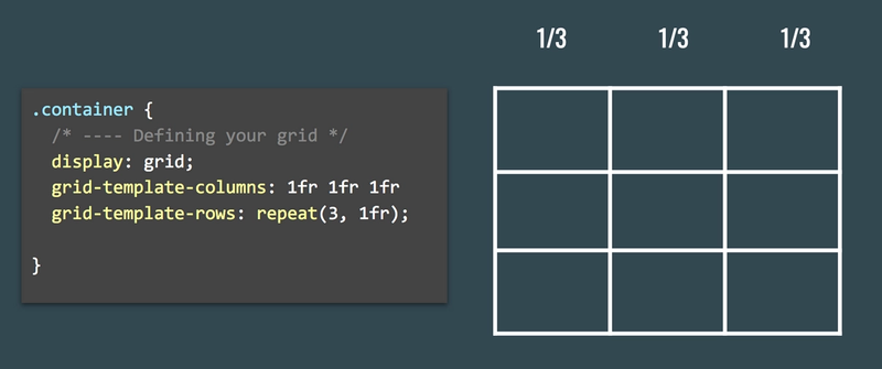
Grid is used like Flexbox by setting the container with display: grid. Then you got to define how many rows and columns you want your grid to have with grid-template-columns and grid-template-rows. For instance:

In this example, I have used 1fr (which stands for fraction) - to split the total space in the grid into three columns. This can also be written in a simpler way, by using repeat(3, 1fr) - which basically means repeat this column or row three times with the size of 1 fraction each.
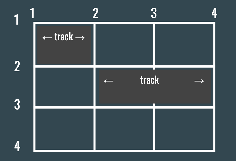
After defining your columns and rows, you can decide whether to position your items by using grid lines or grid tracks. The numbers in the image below defines the grid lines for columns and rows, while tracks is the any group of cells.

With grid-lines, you place each item by defining from which column/row line to which column/row line you want your item stretch. For instance, if I want my .header item to stretch from the first grid line to the last grid line I could use: grid-column-start: 1 and grid-column-end: 4. However, I can also use a shorthand like grid-column: 1/4 . So instead of two codelines, you could use just one! Check out the example below:
To use grid tracks, you first have to define your grid-template-areas by naming each cell. Then tell your grid item which cell(s) it should cover with just one line, grid-area: header. I prefer this method as it is less code and easier to remember the cell names rather than the grid lines 😊.
If the placement of your grid items is not defined then all direct children of the container will automatically be placed inside of each cell in the grid. Simple, right? ✨
What is good about Grid?
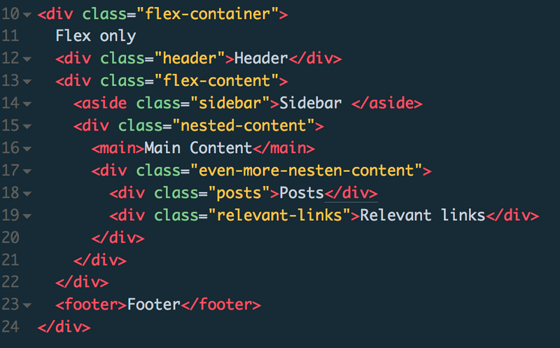
Grid really shines when it comes to dividing your web page into different parts without letting your markup suffer! Imagine going from having a layout with loads of nested flexboxes:

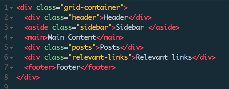
To this simple pure grid markup:

Not only does a pure flexbox layout require nested divs, but it also require more CSS to get padding or margin between each flex item to add spacing between your items. With Grid you can simply use grid-gap. 💁
Of course, Grid is not here to replace Flexbox, but rather allow you to write concise and more semantically correct code! So instead of drowning in infinite nested flex boxer, how about you start using a combination of both Grid and Flexbox? You will definitiely reap of the results! ☺️ ✨
Up next...
Loading…
Loading…
Loading…
Loading…