Spice up you graphs!
Why is it important to make beautiful graphs? Isn't it most important what the numbers show?
4 min read
·
By Therese Borge Lied
·
December 7, 2019
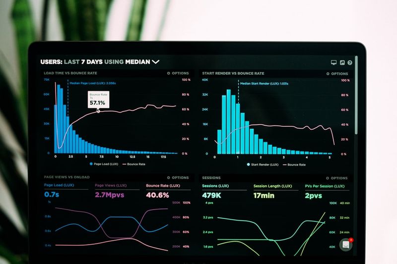
Presenting a graph is like telling a story with data. As the storyteller it is your responsibility to make it as easy as possible for the audience to understand your message. Whether it is a graph you’re presenting to your team, in a board room presentation supporting a potential decision or to a client explaining your machine learning findings, getting your message across is equally important. And it is no secret that a sizzling hot looking graph might help you succeed in doing just that.
First things first, every decent looking graph should build on these three principles:
- Choose the right graph (shouldn't come as a surprise to anyone...)
Let's have a look at this graph. What point can you draw from it?
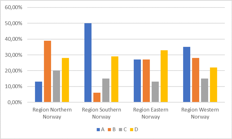
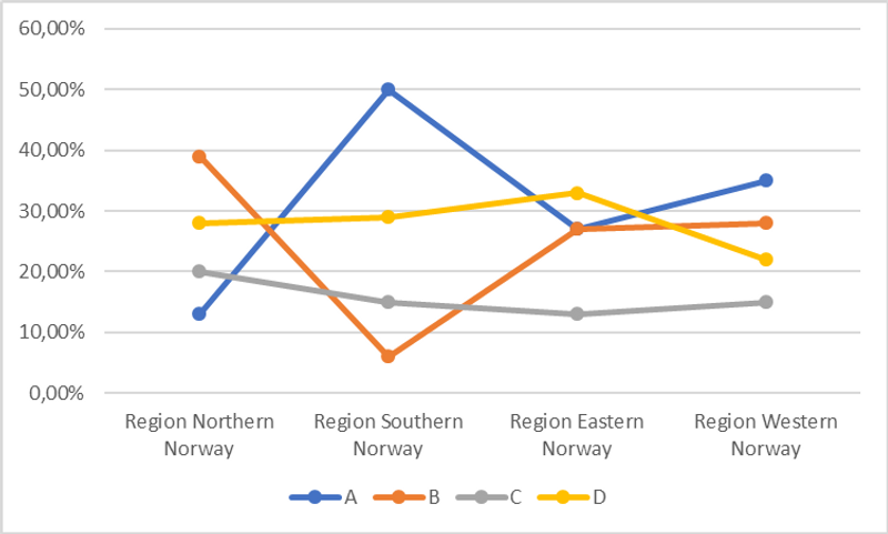
To communicate effectively, choosing the right graph is important. The right graph is therefore highly dependent on which point you want to make. Do you want to point out the difference in market shares between the companies? That company B is the leader in Region North? That the competition between A and B seems hard in Region East? Or that the difference in market share in favor of A over B in Region South is huge? Choosing a line graph instead will let us see the overall picture of the market more clearly.
- Remove noise
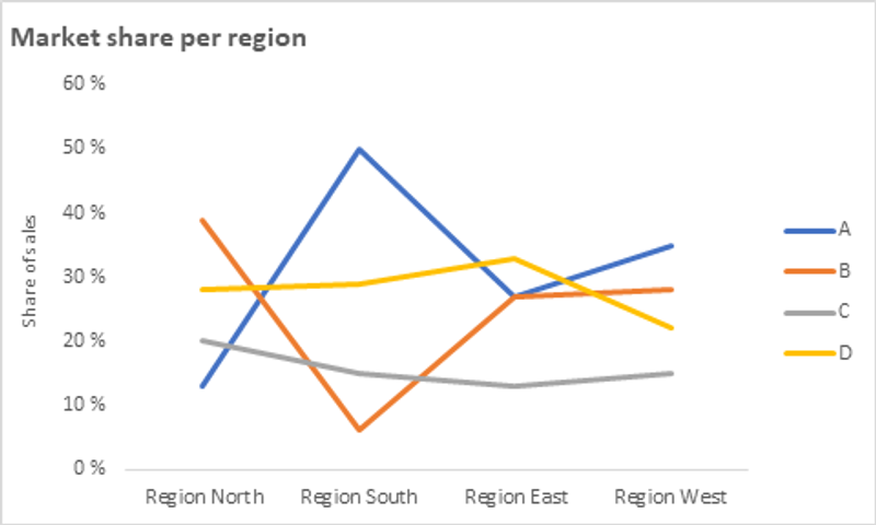
After you have chosen the right graph, it’s time to remove the noise. Throw the gridlines out, away with unnecessary decimals and markers and avoid long variable names on the x-axis. Add a title, axis labels and place the legend preferably to the right (if you need a legend). If possible, try to make it as clean as possible to enable your recipient to receive your message loud and clear.
- Focus your audience’ attention
With a clean and noise free canvas, it is possible to highlight different elements in order to focus the attention of your recipient. Add elements such as a trend line, a reference variable or events that might be supportive to your argument. You can also use contrast or bold effects to highlight further.
Let’s say your point here is the big regional variation in the market battle between company A and B, and that this should be in mind going forward with creating the new sales strategy. Taking focus away from company C and D is a good way of making it easier to understand what you are trying to convey.
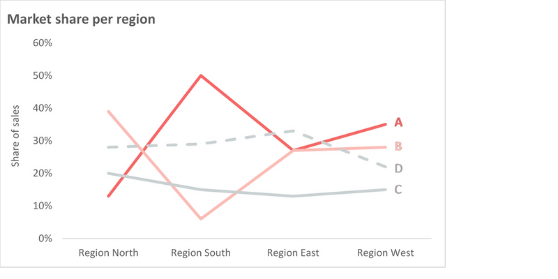
You might have noticed that something more changed in this last example. To make it more than just decent looking, a tip is to stay away from the standard color palette and use some fresh colors instead!
You came here for spicy, but this is not really spicy, is it? There is a lot of exciting stuff you can do in terms of data visualization if you step out of Excel and into more powerful tools such as Python or R.
For the remainder of this article, I will focus on the visualization library Plotly. This is an open source graphic library that supports both Python and R, as well as several other languages. The fun part about Plotly is that you can make advanced interactive graphs which are in another league with regards to appearance compared to Matplotlib. In addition, you can easily export them, and use them both static or interactively in reports, presentations or directly on webpages. The best part is that you only need a few lines of code.
Let’s see how our graph above could look like
This one is quite similar to the one above, except the fact that it is interactive, but the opportunities go way beyond this if you really start exploring. Basic charts, statistical graphs, heatmaps, financial charts and different map charts are all part of the library. You can even make animated graphs, just like Hans Rosling’s famous animated Gapminder bubblecharts.
To get started, you will need to get through some initial steps
- Install Plotly
- Set up an account in Chart Studio if you want the opportunity to export the interactive graphs. Everyone can set up a private account for free. Note: In the version 4
- Go explore and visualize
An important note is that since Plotly is in active development, remember to upgrade from time to time.
If you want to see more examples of the visualizations that are possible using Plotly, check out some of the links below.
Up next...
Loading…
Loading…
Loading…