Dimensionality reduction using Principal Component Analysis
High dimensional data can be a pain sometimes, at least when it comes to visualization and exploration. Today we will introduce one common technique that can potentially ease the pain a bit.
3 min read
·
By Aryan Iranzamini
·
December 13, 2019

The main idea behind dimensionality reduction techniques is to reduce the amount of features, whilst retaining as much information in the data as possible. There are many reasons for doing this, for example lower dimensions means that less computational resources are needed and it also makes it easier to visualize and interpret the data. It is therefore a must know for every data scientist.
Principal Component Analysis (PCA) is one of the most common dimensionality reduction techniques. The magic behind it lies in the math, but today we are just going to briefly introduce it without any potentially confusing variables or formulas. As mentioned earlier, the goal is to find a lower-dimensional representation of the data that represents the original structure of the data just as well. The way PCA tries to find this representation is by first finding the directions in the data with the most variance, these directions are also known as principal components. After the principal components have been found, one can then project the original data points onto the most important principal components and discard the others to achieve a new subspace with lower dimensions.
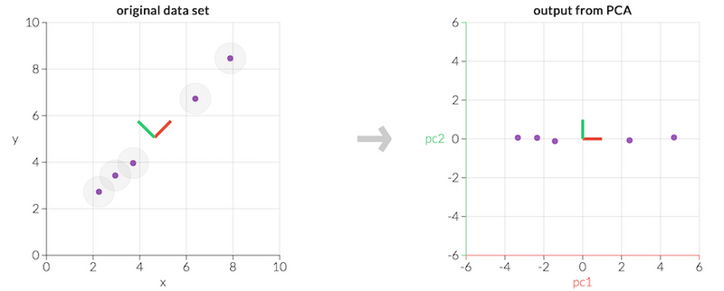
This might sound complicated at first, but let's look at an example.

As one can see in the leftmost graph in the figure above, the data set consists of 5 points in a two-dimensional space. A green and a red line is also plotted in the graph and corresponds to the principal components of the points. The rightmost graph shows what it would look like if one were to project the points onto these principal components.
This might not look like something special at first glance. However if we view each principal component by itself, which can be seen in the figure below, we can see that the first principal component accounts for most of the variance in the data. It is barely possible to distinguish the data points in the second one and it can therefore just be discarded. Thus, we can just use the first principal components to represent our data.

This was an example of how we can use PCA to go from two dimensions to just one, while still retaining all the important information in the original data set. It can be applied to data with any number of dimensions and reduce it down to two or three components for visualization, which makes it a useful tool for every data scientist. For more in-depth information regarding PCA, please see the links down below.
Up next...
Loading…
Loading…
Loading…