The importance of delightful UX
People love delightful digital experiences. It can make the dullest of tasks — an exciting experience. Like filling in forms and paying for groceries. So why aren't every digital experience delightful?
18 min read
·
By Martin Skarbø Sangolt
·
December 24, 2019

What is delight, in the context of user experiences?
For many working with digital services, it's the polish that seems unnecessary. Money out the window. Even UX designers usually don’t focus on this part of design. “I’m not here to make it pretty,” you’ll hear UX designers say. But for professionals like visual designers, it’s essential to their craft. It’s what separates great work from good work.
It’s challenging to describe with words, so let’s get an idea of the concept by looking at some examples.
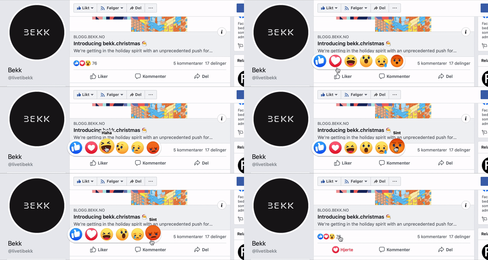
Reacting on Facebook posts\ Do you see those small, delightful animations? Does the cute angry emoji shaking its head make you smile? It might seem excessive, and Facebook could easily have used static icons. But those small details make you want to react on posts — even if the post itself is not engaging.
Sending emails via Mailchimp\ Mailchimp has mastered delight in their communication. When your startup has spent all its energy creating a campaign for growth hacking, you'll proof-read the email you're sending over and over. But you might still be a bit angsty. When you are sending those emails to all your users, this is what Mailchimp shows you:
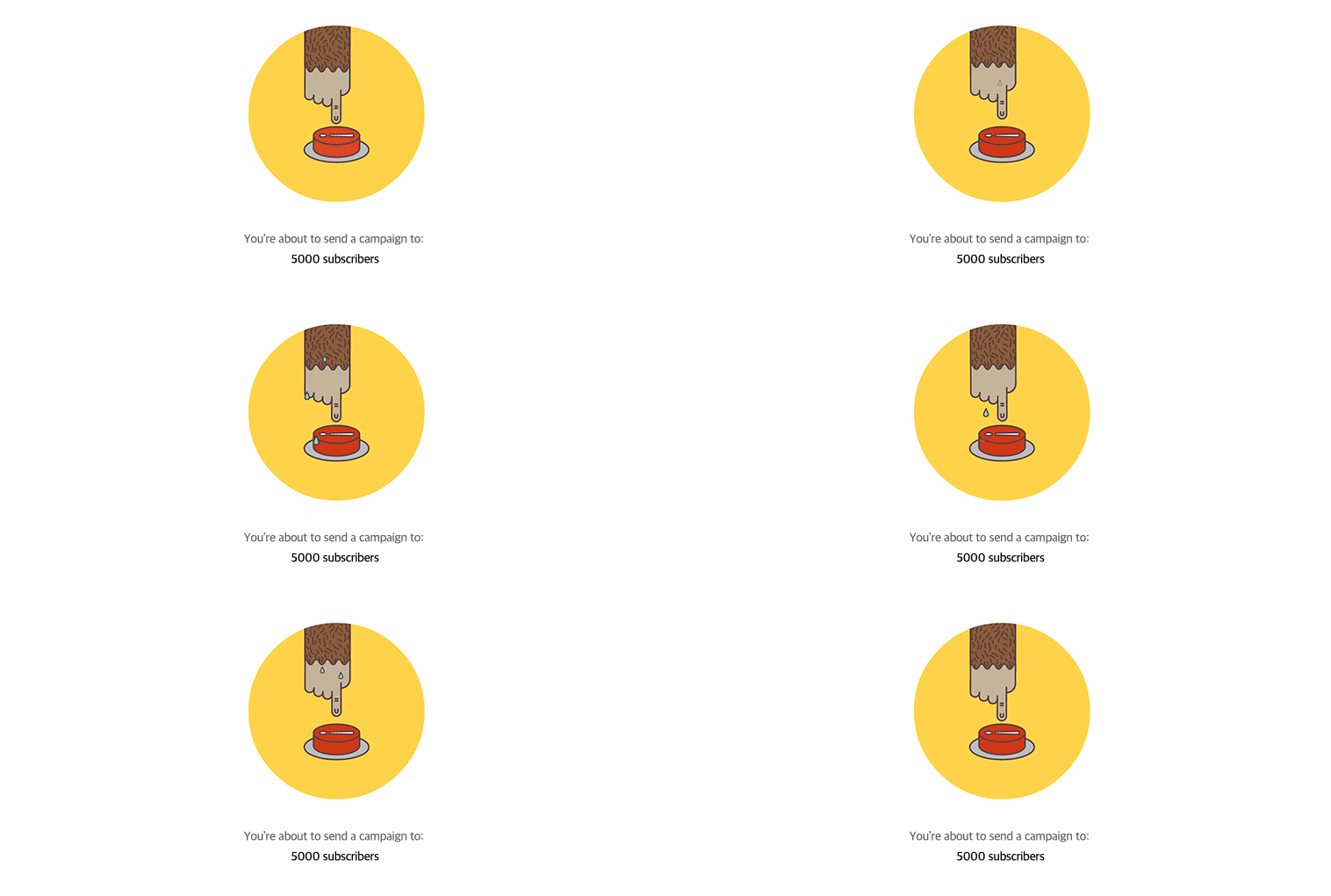
They could have shown us a message saying, “are you sure?”. But the animation tells us so much more. It understands the context. It playfully conveys the angsty feeling. It’s telling users normal to be a bit stressed.
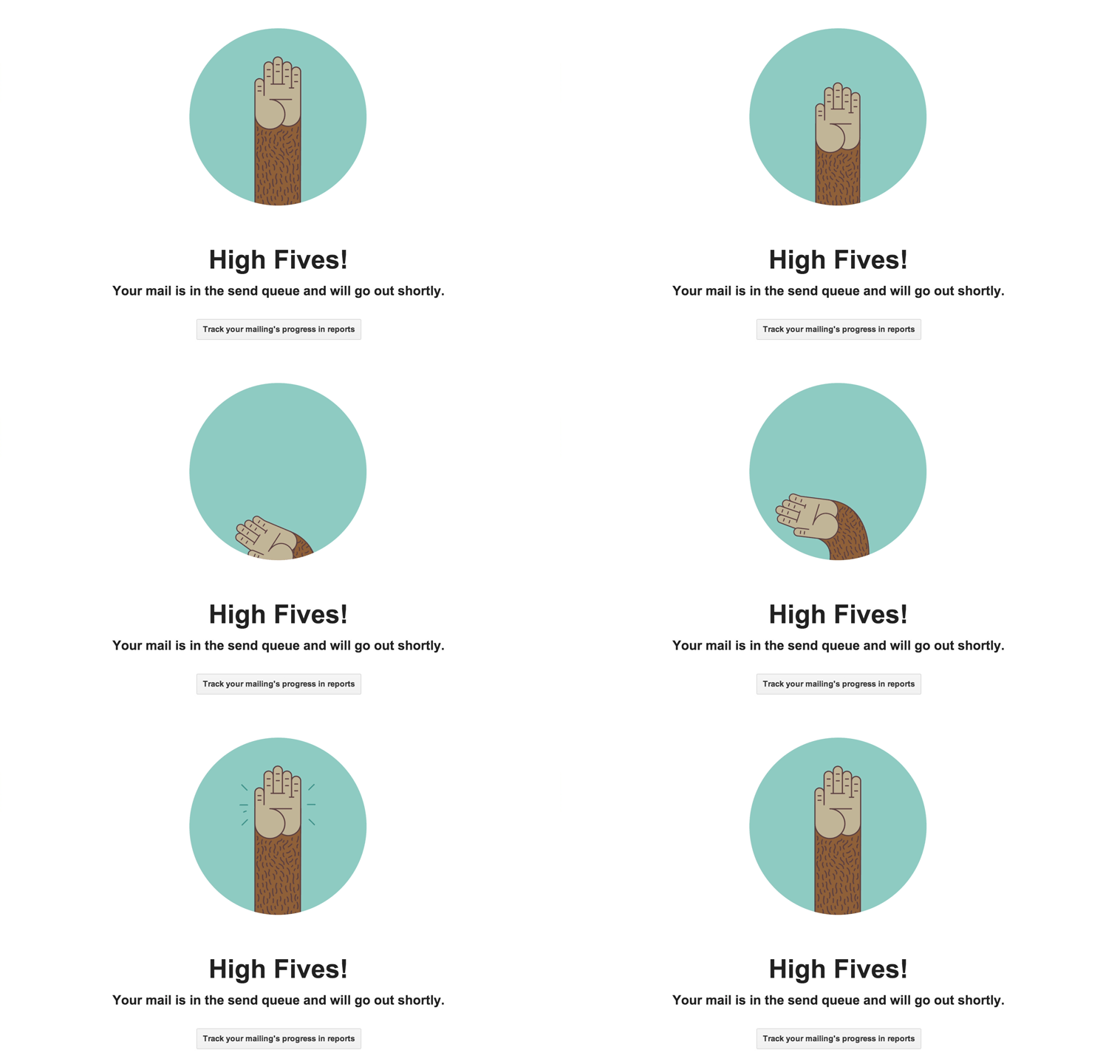
When you have sent the emails, they do something similar. Instead of a system message telling us “emails have been sent”, they give us this delightful message:
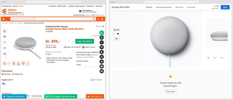
Looking at products on webshops\ Creating delight can be done in several ways. These websites show us the same products, at the same price, but present them differently. Mainly using white space generously to create a more or less delightful presentation:

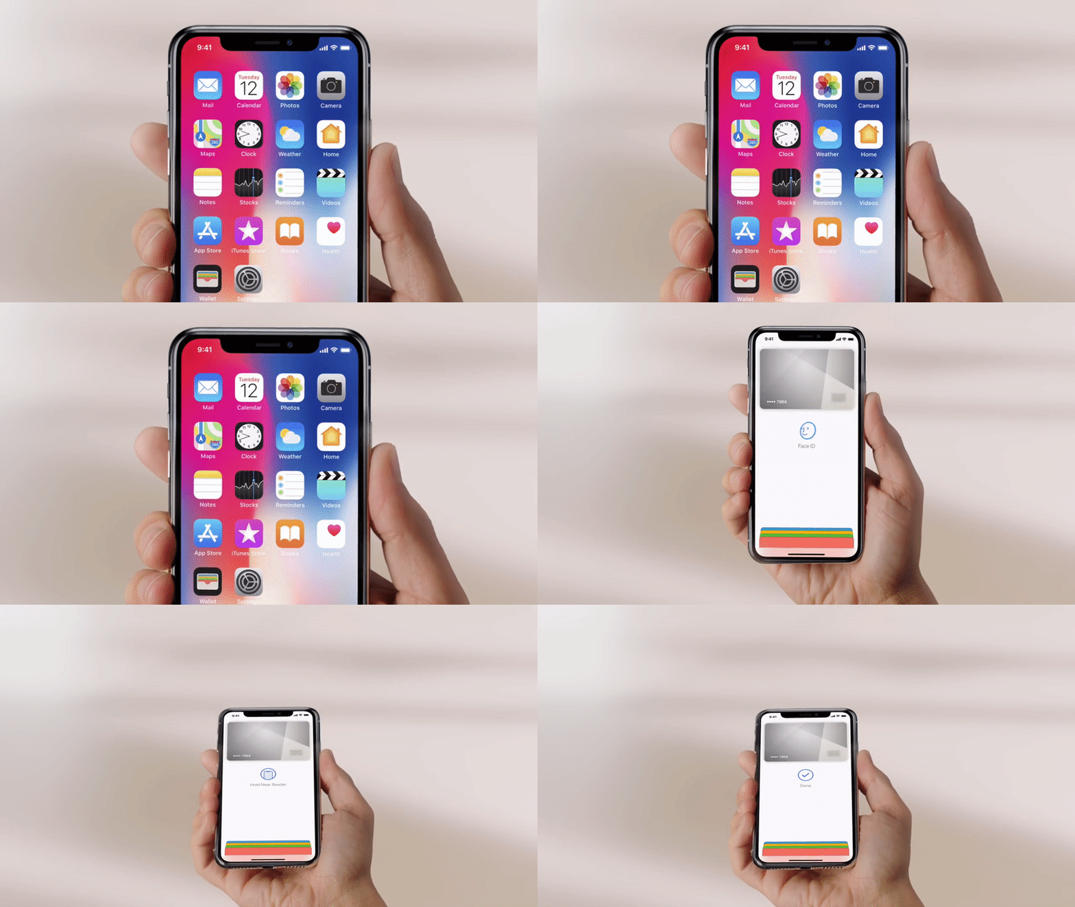
Apple Pay\ Apple is great at making delightful experiences, and Apple Pay is an excellent example. Using your physical credit card might be faster. Rewards are possibly more useful or plentiful. But Apple Pay is such a delightful experience; you'll smile every time you pay. The experience is a fantastic orchestration of physical movement, slick transitions, loads of white space, snappy animations, clear audiovisual and physical feedback. If you haven't tried it yourself, you can get a grasp of the experience here:
Why should experiences be delightful?
By now, I hope you have an understanding of delight in the context of user experiences. But why should products and services be delightful? When I started doing UX work, I asked myself this constantly. Since then, I have worked in several agile product teams. In agile work environments, maximizing value creation is always at the top of your mind. While aesthetic and delightful experiences are something you aim for as a UX designer, you and your team need to spend a lot of time getting there. Time your team wants to spend making new products, creating new features, or fixing bugs — since it seems more effective for creating value.
My focus shifted after I delved into the world of psychology.\
People are humans — not robots.\ Duh uh. But we often forget the implications of this when we create digital services. Humans are faulty. We make choices based upon our past experiences and the knowledge stored in our brains. Our knowledge contains a lot of gaps, but maybe worse, are full of incorrect information. Our brain tries to understand the world around us constantly and unconsciously. When it sees patterns, our brain stores it as concepts in our long term memory by insulating the pathways between networks of neurons. Undoing these strengthened brain paths becomes harder and harder as time goes. Misunderstandings become facts.
At the same time, our energy-hungry brain tries to preserve energy all the time. One strategy it has is habits. Have you done something before? Do not waste energy on making the same decision again. Another one is motivation — rewarding energy-persevering and energy-gaining behavior with addictive drugs such as dopamine. A third strategy is feelings. The brain summarizes the body's energy budget, situational and social context, internal and external perceptions, as fellings to our consciousness. Feelings leave lots of information outside of energy-intensive conscious processes.
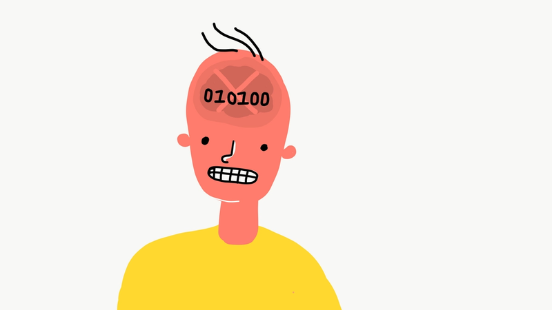
Okay. What does all this mean? Well. Humans make decisions based on their feelings, motivations, habits, and error-prone knowledge. People are not logical, like computers. The same person might end up with an entirely different choice, depending on whether they're hungry or not. If your app asks a user to rate it, the user might give it one star if they broke up with their loved one the same day. A lot of your users might consent to marketing-emails if you ask on a payday. You cannot understand the actions of users by solely looking at their behavior in the context of the service itself.
Human behaviour and its implications in digital experiences\ A lot of digital experiences are entertaining at its core, like games or video services. Users are highly motived to use these services. But the digitization of both public and private sectors, have created a slew of useful, but dull, tools and services.
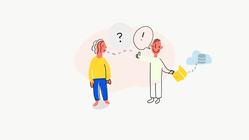
In many cases, manual work has been automated. Before digitization, users contacted a person in order to use a service. Paying bills, ordering food, buying movie tickets, or canceling their subscriptions. Often, this interaction has been replaced by a form. The app or website usually only replaces the former workers' transactional function. Input from the user, output from the system. The human part of the system is lost.
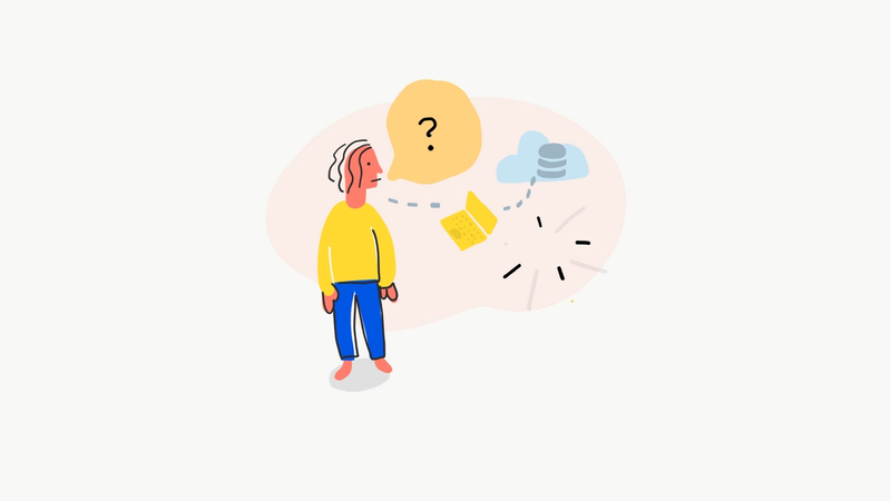
Human functions that typically get lost:
- Correcting information, often without telling the users
- Adjusting the amount of information or complexity, making it understandable to different users
- Motivating users, when they lack the motivation to finish a transaction or task
- Making the customer feel safe or feel like choices are made correctly
- Making users feel heard and seen
- Noticing users emotions and changing behavior to fit their emotions
- Helping users navigate when they are lost
- Helping users self-reflect
While delight in UX cannot change what users experience outside of the services we create, we can make our systems more human with it.
Defining delight\ When looking at successful products and services, they tend to be at the intersection of three lenses. They are feasible; it is possible to make. They are viable; it makes sense financially. They are desirable; users will come and stay.
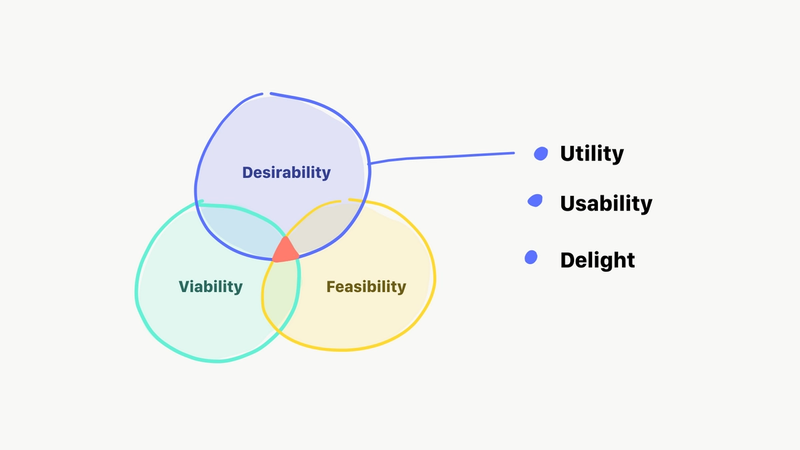
When are products desirable? To make more sense of it, we can look at three aspects of desirability. Utility, usability, and delight. The utility is the most objective quality. Services and products with high utility are useful. They solve problems or needs. A fuzzier aspect is usability. High usability means users are able to use the product, they understand how to interact with it. In the world of UX, conversion rates are typically correlated with usability. The last aspect, delight, is the most mysterious. It tells us if users want the product, or like to use it.
Let’s look at an example. A bottle of sugarfree soda. The utility is its ability to quench thirst. That’s it. The bottle itself has several qualities; it fits your hand and can be transported, you can drink from it without spilling, you can place it on a surface, you can easily open and close the cap. In other words, it is highly usable. But why did you buy this specific soda? You could have bought a bottle of water, or you could have quenched your thirst at the tap. It must have some delightful aspects. Maybe it tastes great?
Delight can be defined as the qualities that make useful services or products, something that users want to use, even when they don’t need to. Delight is often felt trough aesthetics, in its broadest definition. In the context of digital services, we can experience it as visuals, humor, animations, sound, lack of friction, tone of voice, reduction of noise, or unexpected gestures.
Challenges you'll meet as a Delight Champion
If you have come this far, I hope you'll soon want to champion delight in your organization. But new ideas alway meet some resistance. These are some of the typical challenges that you'll encounter when trying to create delightful digital experiences.
Delight is challenging to describe\ When working in teams, creating digital products, we need to explain work to be done. In the world of agile, we often use some sort of ticket system or user stories. But these tools often describe the end result highly abstract or strictly functional. Since delight needs to be felt to be understood, it is tricky to express objectively. You can show an animation by making an animation or showing the humorous copy by writing it — but in an agile team, you'll never want to do this time-consuming work upfront.
Since you won't be able to describe the delightful aspects upfront, you need to create a team culture that values delight. It will require interdisciplinary hands-on collaboration. Creating delightful experiences can be extra challenging in distributed teams.

Definition of Done\ In agile teams, you often want to have a definition of when something is done. This way, team members can more easily work independently. But since delightful UX is challenging to describe, it's almost impossible to define when it's good enough. A digital service can have 100% conversion rates, zero bugs, and be in production (in the hands of the users). And still, it might not be delightful.

Lack of competency\ Small digital teams might not have the skills required to make attractive services. Typical experts of delightful experiences are; Motion designers, Visual designers, UX writes, Copywriters, Illustrators, Front-end developers with lots of experience with CSS or visual technologies. Even teams with dedicated designers or front-end developers, might not focus on delightfulness in their work. Not because they lack the knowledge, but it can be challenging to champion something that's not part of your core skillset.

Measuring the effects\ Yup. Another tricky one. Measuring the impact of something fuzzy is a challenge. You could find metrics, like numbers of likes, ratings, engagement, positive feedback in surveys, or scores in customer satisfaction indices. But these will likely be proxy metrics and be hard to link to economic effects. Loyalty will most likely be your best bet on an economic impact.

Return of investment\ The business case of delight is challenging. When digitizing manual work, you can often predict a reduction in manual labor — the new self-service or feature can reduce the number of customer service workers needed per customer. But the challenges mentioned above makes any prediction of the return of investment difficult. To win over your ROI-people, you can show them the effects of optimization. Adding delight to an existing service or feature can radically change conversion rates or engagement. It can be the little push of motivation users need to interact with your product.

Let's get theoretical
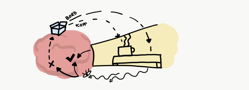
In order to understand how we can use delight in practice, we need some understanding of how we experience the world and ourselves. How do perceptive and cognitive processes work, in a nutshell?
Perception\ How our brain handles raw data from our internal and external stimuli, filters it, and converts the data to information — is called perception. The processes are highly unconscious.
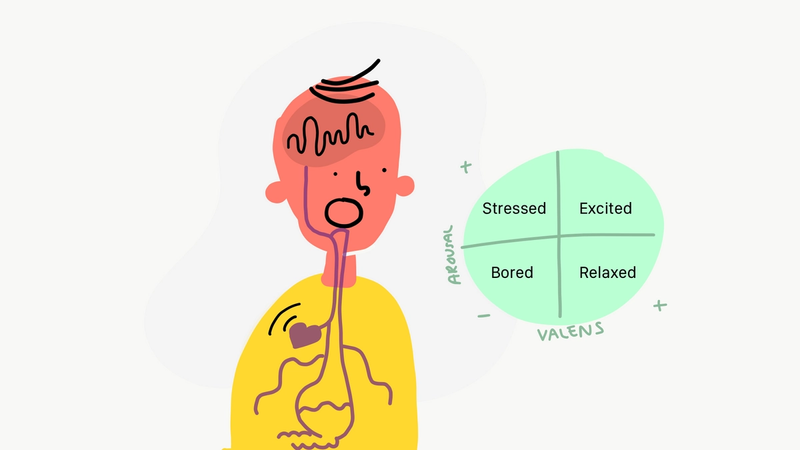
Internal sensing is called interoception. Our brain gets data from internal organs, our immune system, bones, and more. Sometimes this data is presented to us consciously, like feeling your heart racing or being hungry. But usually, we only get the summarized form of our body state, sometimes referred to as affect. Our affect has two main parameters; valence (pleasant/unpleasant) and arousal (activated/deactivated). In practice, we could call affect basic emotions. It tells us whether we are stressed, bored, relaxed, or excited.
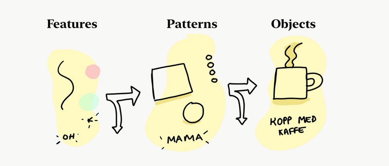
External perception is referred to as exteroception. It's what most people think of when they hear senses; hearing, tasting, touching, seeing, and smelling. Our perception processes this data to features (colors, edges, soundbites, etc.), filters data, and continues to form more and more complex information and understanding of our surroundings. All the objects you perceive are stored as mental copies in our long term memory. Called mental concepts and models. Creating mental models is an energy-intensive and time-consuming task. Our brain, consequently, continually tries to match our environment with past experiences. If it finds a match, it makes shortcuts and stops processing external sensorial data.
Cognition and simulation\ Our brain processes information from our perception, in mental activities called cognition. The information from our senses is combined with the context (time, place, situation), our mental concepts (knowledge, experiences), and conscious thought. Our brain then simulates the world, so we perceive it consciously. In other words, we don't see with our eyes, but with our minds.
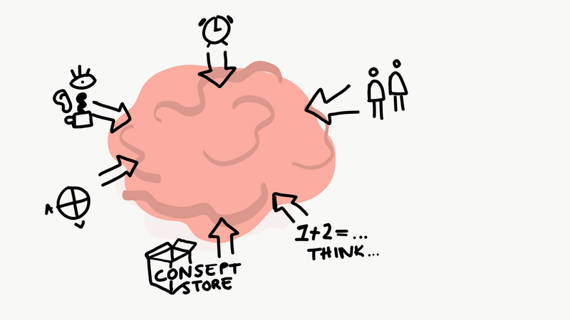
When we create delightful experiences, we can help our brain with its perceptive and cognitive processes. We can help it filter out unnecessary information and focus on what's important.
Examples of theory in practice
We now have enough knowledge to get our hands dirty. The fun part. Let's look at four examples of techniques we can use to make our experiences more delightful. Many of these examples are from a Norweigan insurance company, Gjensidige.
Micro-interaction animations
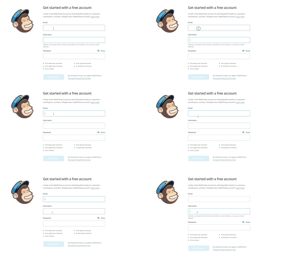
In this example, the create a new account form at Mailchimp, some information only appears in context. The small animation in this micro-interaction is more crucial than you might think.
We know that our perception filters information, sometimes never reaching our consciousness. Our visual systems can hold information in about 200-400 milliseconds. If we look at a UI on a screen, fixate our eyes on a button on the right side — then look at some text on the left side. Our visual memory regarding the button is soon lost, and our eyes get minimal stimuli from the peripheral vision. We still see the button in our mind, but it is now strictly simulated by our brain. If small changes happen to the button — like the text changing, we will be blind to it. We'll experience change blindness.
When we change the information in our UI, we need to be aware of how we can reduce change blindness. You have to main tactics; do not be subtle — change placement, colors, shapes — or, use small, delightful animations that our peripheral vision can perceive.
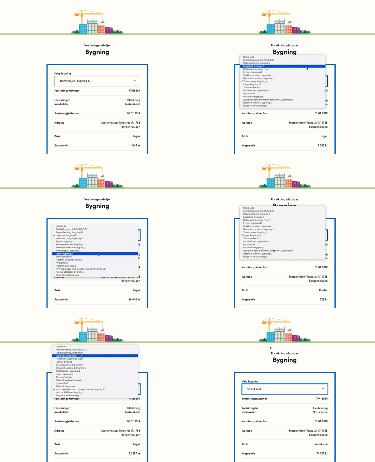
Here are some examples of how these subtle animations can be implemented in a UI:
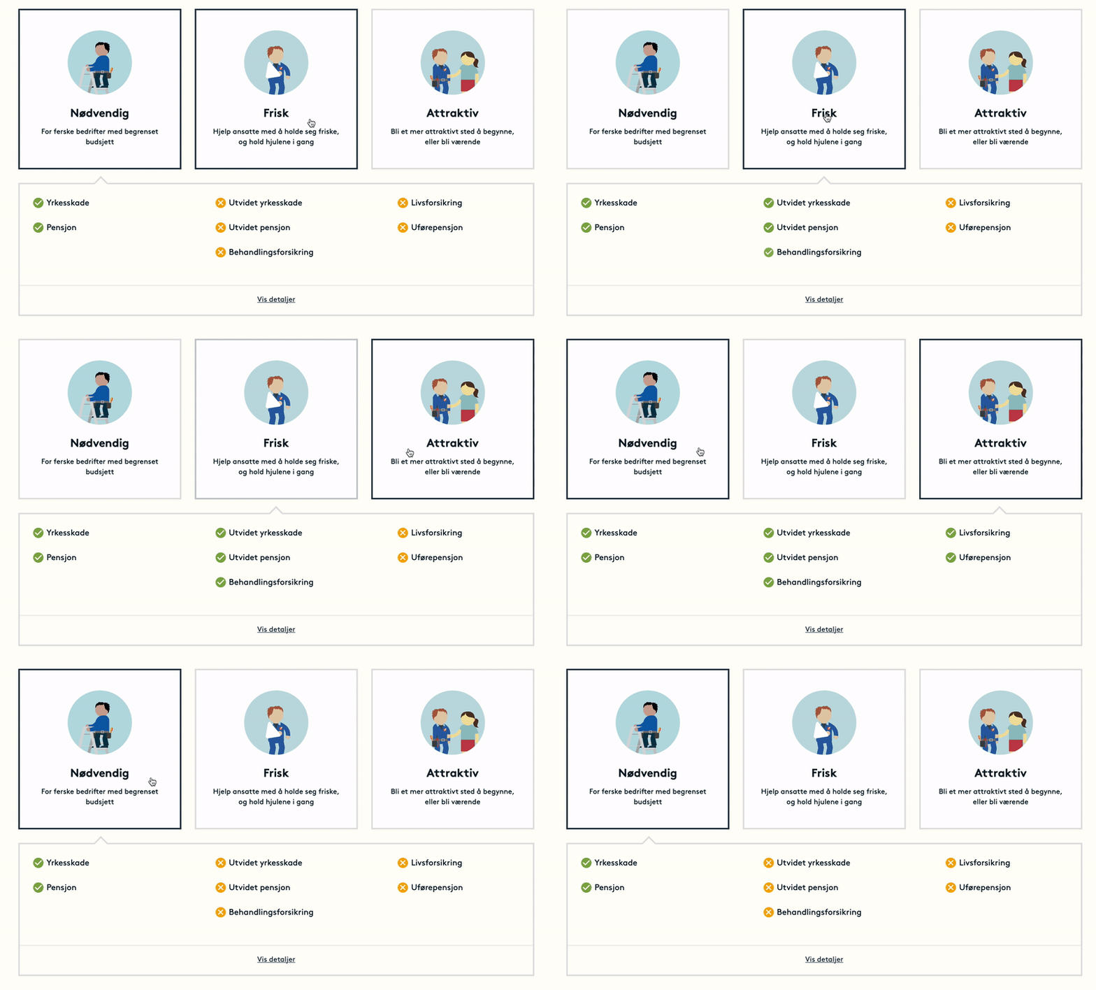
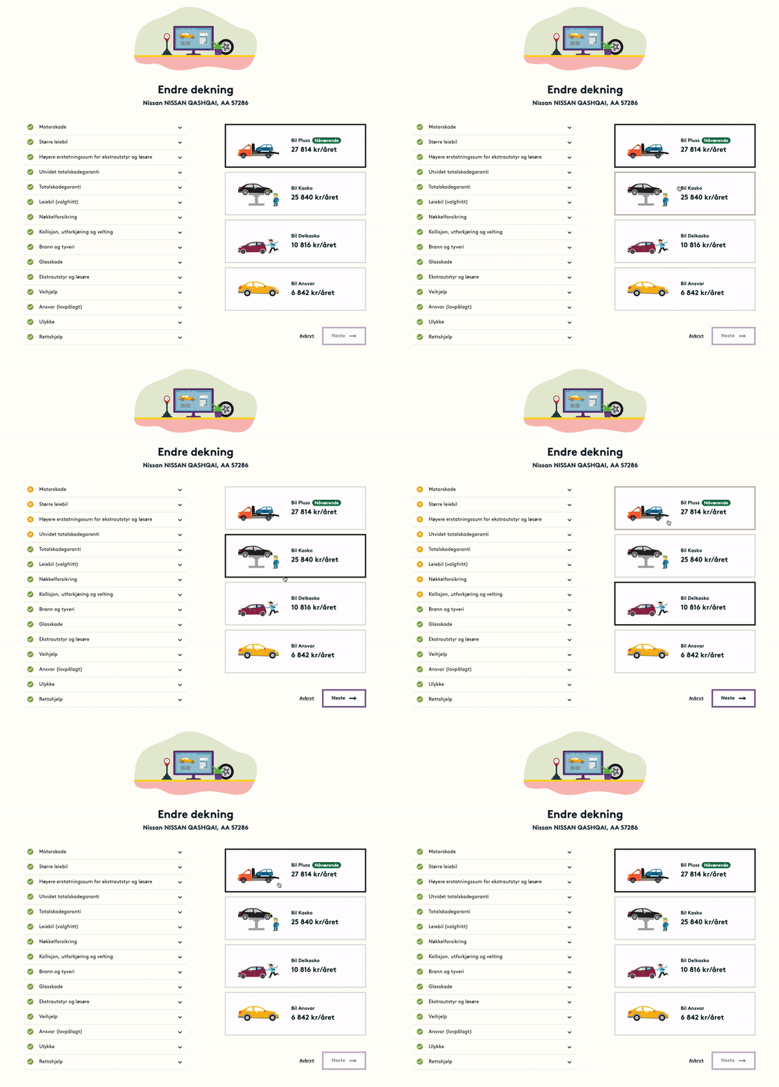
When users interact with your UI, and the information is not changing, you can still use subtle animations as feedback for the user:
White space and introduction animations\ When we are stressed, like filling in a web form for the first time or buying a train ticket while running to the station, our brains spend a lot of their resources filtering out noise. We are experiencing a high cognitive load. In these situations, our mind is not able to simulate as much of our environment as usual. The useful Field of View (FOV) is reduced. We experience it as tunnel vision. This effects user experiences significantly; users are not able to consume the information presented — and can have difficulties navigating UIs.
Making experiences more delightful can reduce cognitive loads of our users. A tactic is spreading the amount of information in time and space.
If you look at this form (in Norweigan), there's actually only one input field. But the users are exposed to a lot of information, helpful tips — increasing cognitive load — and ironically make the form more difficult to complete. When you focus on the input field, your brain tries hard to filter out nearby information — making you blind to nearby information you might need:
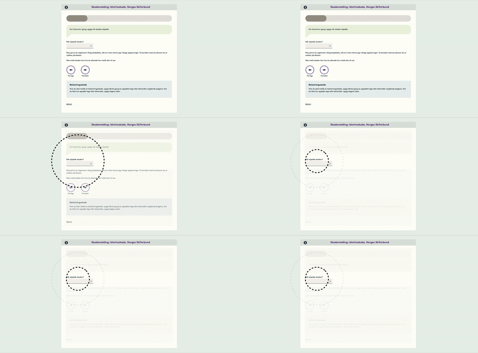
If we introduce a lot of white space, we can reduce the cognitive load. Like NAV has done here:

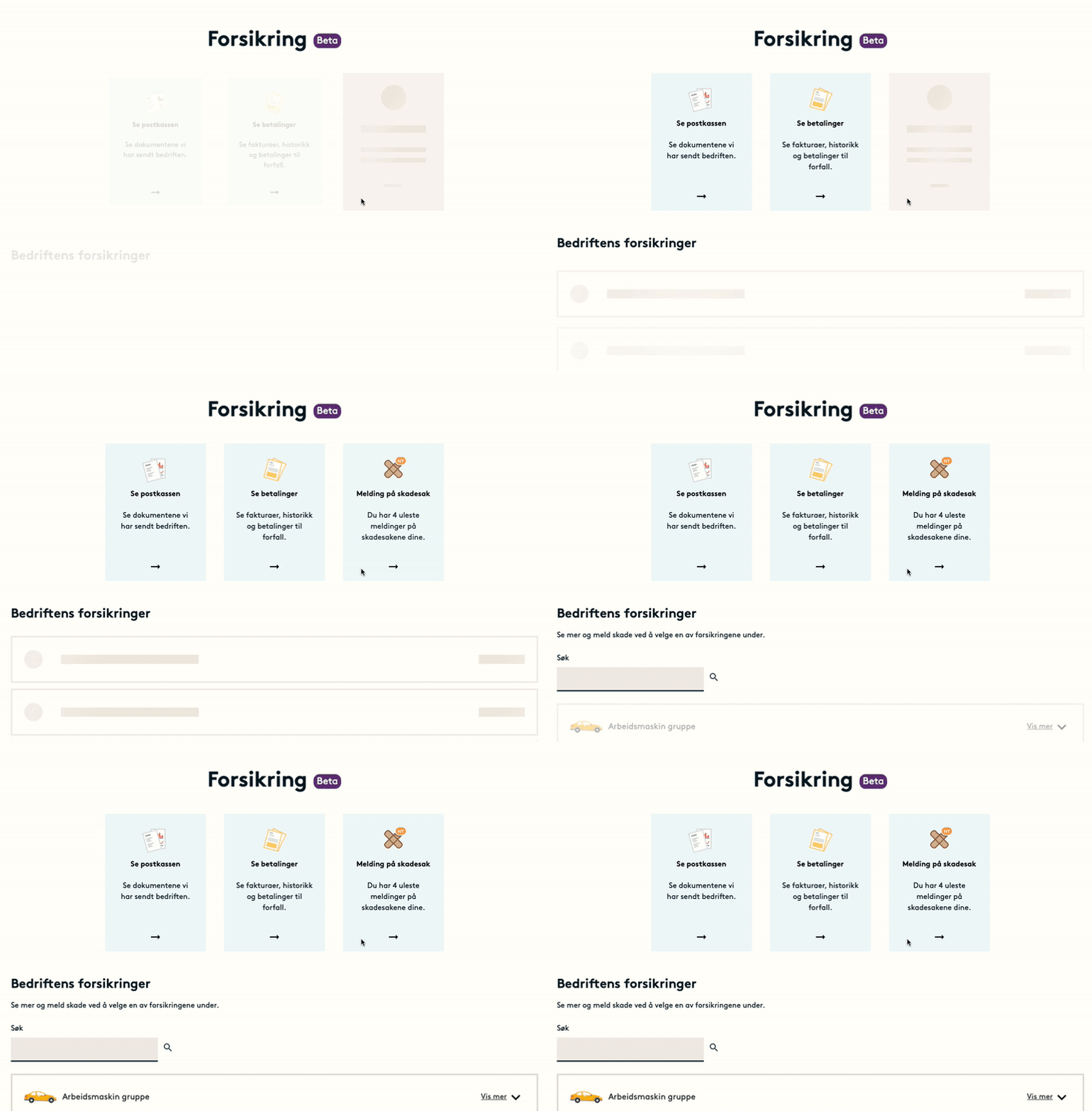
Another tactic is presenting information over time. Using subtle animations to show one and one UI element as the user scrolls the UI, loading content bit by bit — or going all in presenting information through movies and animations.
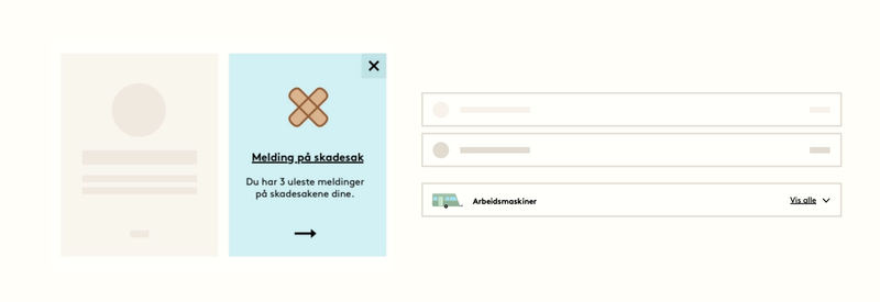
A way to expose information bit by bit is loading content with skeleton loaders. Adding more and more details over time. You'll find this all over in feed-based applications such as Instagram and Twitter. This is how we did it, at Gjensidige:
Visual representations of information
Perceiving information takes time. But our brains can parallel process information if the type of input is both visual and verbal. This is sometimes referred to as the Dual coding theory of working memory.
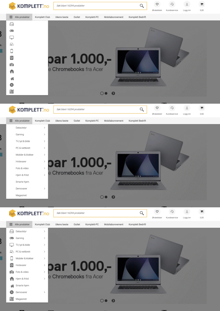
If you can inform users using visualizations and copy, they can process information much faster. Your team might not have the resources to create elaborate illustrations or infographics, but you can make interfaces more efficient and delightful by introducing icons in your navigation.
An example is this Norwegian webshop, Komplett.no. The combination of both icons and copy is what makes their navigation fast to use:
Spatial animations and transitions\ The brain maps the physical world. The mental map contains landmarks and updates on our current position, speed, and direction. Experiments on mice show that their minds do the same with the digital world. And likely, this is the same for humans.
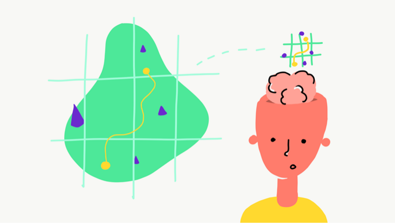
If humans create mental maps of digital experiences, we could help users navigate and create navigation models — with spatial transitions.
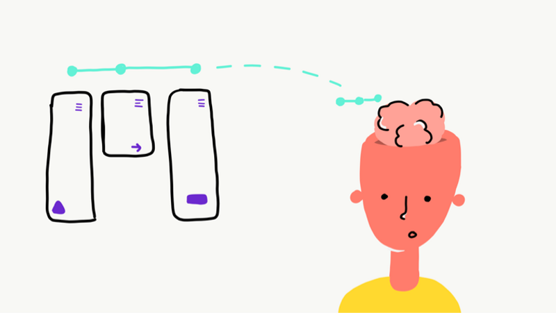
These animations can be over the top sometimes. On larger screens, they can be lengthy, demanding on the hardware, and distracting for users. But used carefully, we can really help our users navigate our UIs. Since our brain looks for landmarks to effectively navigate, we should be careful about hiding or changing UI elements without any interaction from the user. Let's look at some examples for spatial transitions:
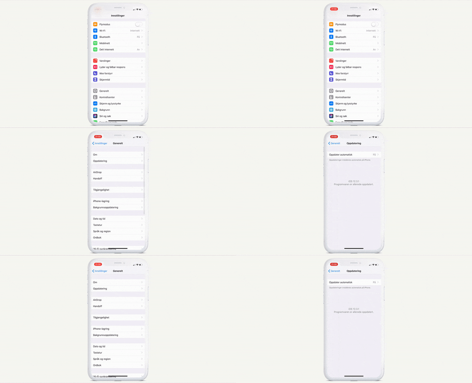
Settings on iPhones, creating a feeling of two-dimensional space:
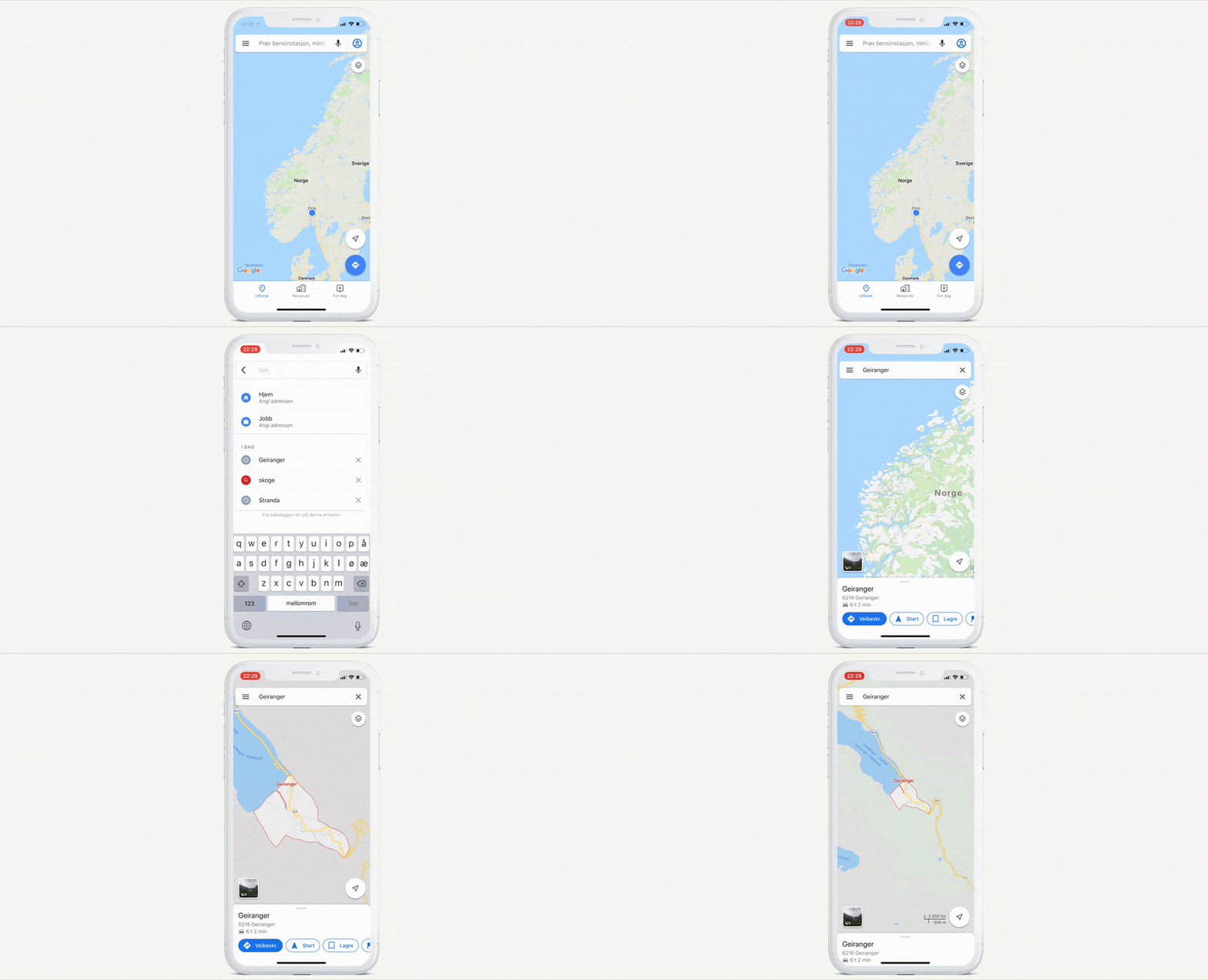
Google maps, animating zoom to show users where they ended up:
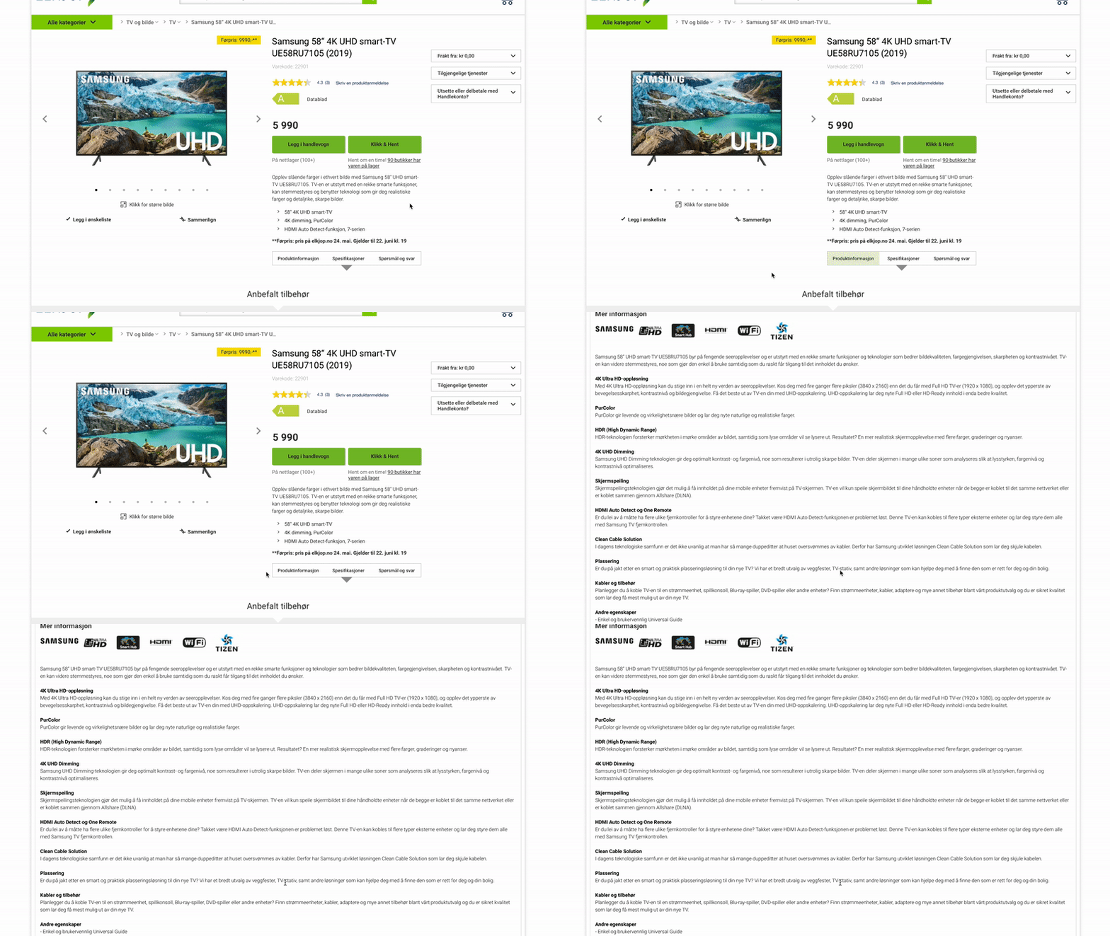
A webshop, Elkjøp, jumping to the right place on the page with no animation:
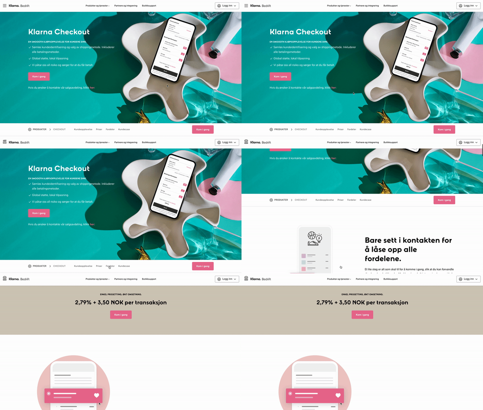
The same type of interaction on Klarna's website, where the animation clearly helps us understand where we have navigated from and to:
What the examples have shown us about delight:
- Reduce change blindness by making changes less subtle, e.g., using small animations.
- Reduce cognitive load by using white space or presenting information over time.
- Use visuals to make users comprehend information faster.
- Use spatial transitions to help users navigate faster.
Where should you start?
If you're creating digital products, you could get inspired by the examples above. Try to map out useful features and services you have that still have low levels of engagement or low conversion rates. This might be the place where focusing on delightful user experiences can have the most impact.
Since delight is a way of humanizing digital services, you could try thinking of your product or service as if it was human. Asking yourself questions like, "If my service was human, how would it react in this situation?", "How and when would it tell our user this information?" or "Would they ask about their input like this?".
You can even pair up with a person in your team, and go through the experience you're creating - as if it was a dialog. Does it feel natural? Can you make changes, so it feels even more human? This can be a great start to create more delightful experiences.
If you need more theory to argue for making delightful UX, I would recommend looking at literature from Colin Ware, such as Information Visualization, perception for design.
But wait, what about business impact?
Some of my examples in this article have been from my work at Gjensidige Insurance. When looking at the numbers, especially when we have optimized existing experiences with delightfulness in mind, we saw some remarkable results.
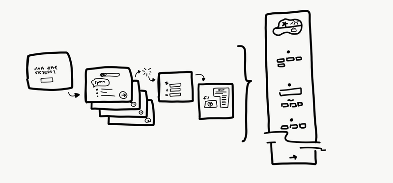
When we optimized some of their forms without adding any new features but creating a smoother, more engaging experience — conversation rates jumped, some as high as 400%. Creating massive business impact. The end result is still very functional, but is a delight to use:
Try it yourself. Create more human experiences that delight your users. It will make your team more proud of what they make, and it will make your users more engaged with your products. It will make a positve impact on your business.
--
Illustrations by me. Movie by Thomas Fjeldberg-Norheim and Elin Ohme.
Images and gifs are screen recordings from Gjensidige, Mailchimp, Apple, Hifi klubben, Proshop, Elektroimportøren, Google, Facebook, Klarna, Elkjøp, Komplett and NAV.
Up next...
Loading…
Loading…
Loading…
Loading…