Digital typography and accessibility
Have you ever realized how important text is in the digital sphere? It’s impossible to avoid text, whether you are to read an article, search for information, watch a video, or complete a task. In fact, it is estimated that about 95 % of the internet is text (1). This vast ocean of text states the need to welcome everyone to read, interpret, and understand - regardless of their abilities or disabilities. If you design or develop digital content, you have a responsibility to do so. And I’m here to help!
6 min read
·
By Ragnhild Finsveen Liven
·
December 7, 2020
Web accessibility aims to include everyone - to the best of their abilities - in the digital world. If you’ve ever stumbled upon WCAG 2.1 or other frameworks or guidelines for accessibility, you might have noticed that it's often about text. It might be about typefaces, fonts, visual appearance or hierarchy, or about code and what’s happening “behind the scenes”. This article aims to give you some clues about what makes typefaces and texts legible and readable. More specifically, the emphasis is on how to make text accessible for those who are able to receive textual content through their sight – e.g. those who can read without the help of screen readers.
Side note: There are ways to facilitate “reading” for people who are e.g. partially or completely blind, as well, but this is outside the scope of this article. I do, however, strongly recommend that you research this topic also!
Legibility and readability
I must admit that I for a long time believed that legibility and readability were synonyms. So, before we move on, some clarification is necessary. Readability refers to the text’s overall accessibility. In other words, how easy it is to read/receive a chunk of text. Legibility, on the other hand, refers to how easy it is for the reader to decode and differentiate individual letters in a word. I will refer to both terms in this article.
The design of legible and readable typefaces
The letters in a typeface should be clearly distinguishable
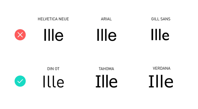
Clearly distinguishable letters in a typeface make it easier for the reader to decode a word within a sentence. In the examples shown above, it is quite clear which letters are distinguishable and not. The most common examples of similar letters are I and l (i.e. a capital i and a lowercase l). Helvetica, Arial, and Gill Sans are all popular and common typefaces. However, their legibility is weakened due to this problem. Even if there is a slight difference in the thickness and height of the two letters, these differences are so small that most of us struggle telling them apart.
The letters in a typeface should be airy and open
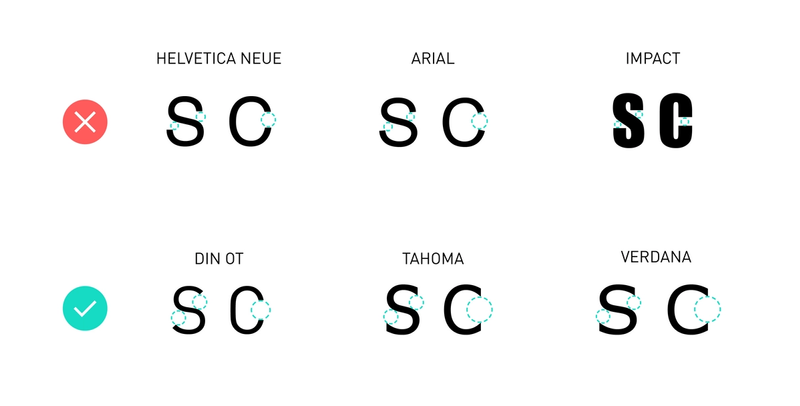
When using airy and open typefaces, the reader is less likely to perceive each letter as a blurry, closed shape. A dense C can for example be mistaken for being an O. “Impact” is an example of a typeface that has a low degree of airy- and openness. In general, such typefaces do best in large sizes and short sentences, e.g. as headlines.
The letterforms in a typeface should have an adequate internal contrast
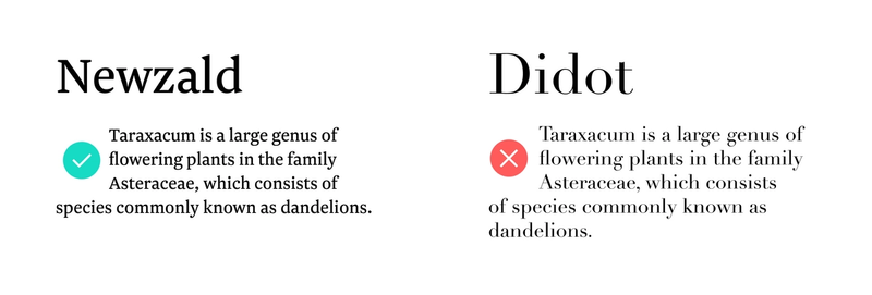
Slight differences in a letter’s internal contrast - i.e. different thickness throughout the letter - make it easier for the reader to recognize its shape. The letterform becomes more unique, which strengthens the typeface’s readability. In the given examples, it is clear that the internal contrast should be neither too big, nor too small. Didot is an example of a typeface that has a high degree of internal contrast. It works well in large formats but is difficult to read in smaller sizes. Newzald on the other hand works pretty well in both sizes.
The letterforms in a typeface should have an adequate general contrast

Even though thin or light fonts can make your design seem minimalistic, clean, and airy, they do not promote good readability. Light and ultra-light fonts are usually difficult to read as they have too little contrast to the background. However, too much contrast – i.e. black or heavy fonts – results in a low degree of airy and openness (see point number 2), which again lowers legibility. Balance is key.
The design of readable texts
Contrast

The contrast between the text color and background color is important to promote readability. Too low contrast can make the text difficult to see. Too much contrast can strain the eyes and lead to fatigue (for example 100 % black text on 100 % white background). The latter especially goes for texts that you read over an extended time period.
Luckily, guidelines such as WCAG 2.1 provides us with a standard. The contrast ratio should be at least 4.5:1 for small-sized text and 3:1 for large-sized text. Text from 18 px and larger are considered “large text” (2).
Line length
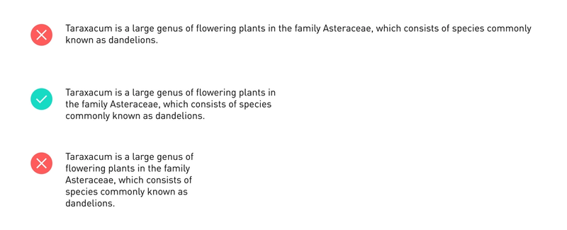
Line length refers to how many characters there are per line of text. In general, shorter lines are the easiest to read, as too long lines can be tiring for the eyes. The longer a line of text becomes, the longer our eyes have to track the text horizontally. This makes it harder and harder to keep up with the vertical process of switching between lines when you read. In the end, you might lose track of where you are within the text. But then again, too short lines are tiring as well, as it makes you switch vertical focus too often.
Keep your line length between 45-75 characters per line (including spacing) (3).
Line-height
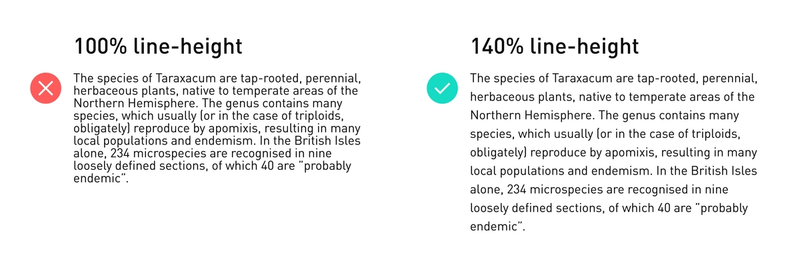
Line height is the spacing between each line in your text. If the line-height becomes too small, the text can become cramped and blurred together. If it’s too big it is easy to get lost.
Line height is usually set as a percentage of the text size. Generally, the preferred line-height is about 150 % of the text size (3). So, if you have text that is 16 px, you could set your line-height to 24, which is 150 % of 16.
Alignment
How you choose to align your text affects its readability. In general, there are two types of alignment styles you should avoid.

The first is justified text: when the spaces between words or letters are stretched to make the text align both on the left-hand side and the right-hand side of the text column. Justified texts usually have many unnaturally large spaces and “rivers”. This lowers readability. Furthermore, it is easier to navigate a text when the right-hand side is uneven (as it is when you use “flush left” alignment) because each line has its individual length.

The second is centered text: when the text is symmetrically aligned along the axis in the middle of the text column. You should first and foremost avoid this because it is difficult to see where a new line starts. When there is no permanent start to a new line the reader can easily get lost in the paragraph and lose focus. Because of this, centered text does best in headings or short paragraphs.
Conclusion
As you can see, many factors influence the accessibility of text. If you are lucky enough to work with a design system, many of these guidelines are likely a default part of the components you work with. However, it is always good to bear in mind these guidelines and that you have a commitment to make digital content receivable and understandable. Easy measures can make a lot of difference for your users, whether they are visually impaired, stressed, dyslexic, tired, color blind, distracted or so on. Good luck!
Up next...
Loading…
Loading…
Loading…