Create more efficient and accessible interfaces by adding visual redundancy to your UI components!
2 min read
·
By Live Jacobsen
·
December 1, 2022

Create accessible components by making them redundant
Several of the WCAG requirements are built on the concept of "redundancy" – repeating the same information several times through different means.
Redundancy can be providing the user with a text alternative for non-text content (1.1.1), an alternative for time-based content presented through video or sound (1.2.1), and captions for pre-recorded video with sound (1.2.2).
When users scan an interface to make sense of its contents, there are 5 visual "channels" that can be utilized to help in this understanding: shape, colour, texture, motion and depth.
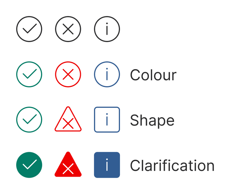
"Visual redundancy" refers to the conveying of information by more than one visual channel, like displaying the meaning of a symbol through both shape and colour.
Example
- Three relatively similar icons with different meanings
- Redundancy with colour. Will not necessarily make a difference for those with impaired color vision or vision.
- Redundancy with form. Will help those with impaired color vision to a greater extent.
- Clarification with more color. Will to a greater extent help those with impaired vision.

Redundancy increases search efficiency
When we combine the features of several channels, we give users the opportunity to perform a visual search in more than one way. This allows the user to search more effectively with their eyes, see the difference between elements more clearly and find the information they are looking for more quickly.
Visual searches are fast, and redundancy makes a search go just a fraction faster. Meaning the effects of redundancy are more apparent when there are many elements to search, as in information-dense interfaces.
It is beneficial for those with impaired vision or colour vision to have alternatives that are comprehensible to them. Hence requirements 1.4.1 “Do not use presentation based solely on color”) and 1.3.3 “Instructions must not rely solely on shape, size, visual location, orientation, or sound to be understood”. Clarification also lowers the risk of errors due to cognitive load or cultural differences in colour perception.
So what are you waiting for?
Make your UI components visually redundant, today!