The Figma Paradox
Figma was intended to accelerate the process from idea to implementation, but are we actually slowing it down? Let's review that approach.
4 min read
·
By Preben Aas
·
December 7, 2023

In this article, I start from the assumption that you are a designer, and using a design system, not building it. You also work in a team with developers and a product manager, and you and your team practice agile methodologies.
Design work: your responsibility as a designer
Traditionally, a designer's responsibility and role is ensuring the usability of the service or system built by their team. Yet, a less apparent aspect of this role involves striving for commercial viability. Whether in public or private sector, there should always be a means to measure the outcomes of an investment. Viability work is very challenging, if not the most. As design work is important in both innovation and maintenance, this work has to align with the intent of investment. In another way: make sure you get bang for the bucks.
That is why it’s important what you do, and how you do it. So let’s look at how you use Figma.
The true essence of Figma
Figma is a popular platform used by the designer or a team when designing digital products. The sketches and mockups within Figma serve only as a groundwork and platform for discussion for you, your team, and the product manager. The sketches aren't conclusive at all. Production is.
Production is the software that exists in the real world, and hopefully valuable for users. Investing time in aligning your sketches with production is unnecessary. Considering fixing your sketches post-production highlights that Figma lags behind. And revisiting old aspects is similar to what developers term as debt. Sketches are sketches, not technical debt. They don't require tidying up because they are only a shared understanding and common ground at a specific time, place, and focus. Nor is it documentation or an "experience transfer" to someone else. Continuously tidying up sketches is an endless task that keeps you occupied but doesn't contribute to adding real value.
The implementation of a new feature occurs within the scope of production, with your team. My most significant advice is to communicate with your team every day. Ensure you’re on the same Figma page ;-) As long as you do, your sketches are totally fine not being picture-production-perfect. Do you struggle with messy sketches that don’t resemble those on Dribbble? Excellent! That's an indication of using Figma as intended. It merely represents and materializes current thoughts and ideas, a canvas for ideation. Spending excessive time refining sketches and redesigning Figma prototypes to match production indicates misdirected efforts. Strive to create great and beautiful design, but remember: do the work that needs doing.
I would recommend reading an insightful article by my colleague, Ragnhild Liven, who shares a similar perspective on prototypes: kill it.
Your work's fidelity matters
By now, you might be thinking: "but this does not apply to me." Maybe it doesn’t, or maybe it does, and you just don’t want to admit it.
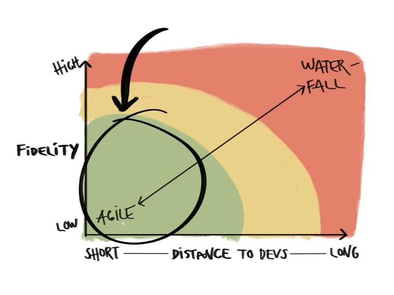
Fidelity in design often refers to the accuracy to an original or intended design. It can include the level of detail, accuracy, or fidelity to the original concept. I believe that the need for fidelity matters in relation to how closely you work with your team, how "agile you are," and the self-evident platitude: it depends. Of course. Designing a system for critical operations within e.g. health, taxes, or military operations have different requirements. So, this does not apply to all.
However, if you are working in a well functional team and have this mindset, you want to be working within that bottom-left area.

The Figma paradox
Figma was designed to facilitate the swift design of digital products and solutions, and undoubtedly, it accomplishes this goal. However, as Figma evolves, I observe tendencies toward unnecessary complexity, at least among its users. Figma incorporates features previously exclusive to code, such as styling, variables, variants, components, and tokens. Don't misunderstand; this incorporation is fantastic and bridges the gap between code and design. Yet, it often tempts users to delve into unnecessary details where they really shouldn’t. This behaviour isn't due to the system compelling us, but rather because we find it challenging to resist. This is common with all tools.
Realistic, functional prototypes aren’t viable unless Figma is transitioning to a no-code platform that pushes high-fidelity sketches directly to production. It’s essential to maintain the right level of complexity, allowing sketches to be a common ground for the team, and serving the purpose as food for thought.
Up next...
Loading…