Experience design for monkey minds
Using the tree of knowledge and the monkey mind concept as a metaphor for thinking when doing experience design.
6 min read
·
By Emil Danielsen
·
December 14, 2023

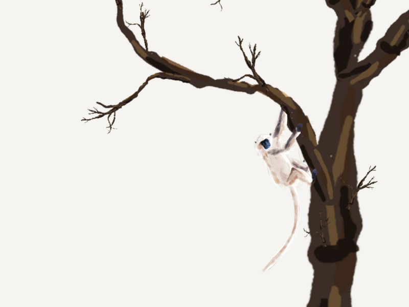
Have you heard of the daoist concept of the monkey mind? The monkey represents your focus, your intentional thought. You can tell it what to do, what branch of thought to sit on - but if you're not telling it where to be, it will jump around from branch to branch.
Neuroscientists have since described this phenomenon in more mechanistic terms, and named the undirected monkey the "default- mode network", more of a mind wandering state of mind. It is the state of mind we are in when we are not thinking about anything in particular.
What I want to do today is to expand this metaphor to make it more useful as a tool for experience design. When we design experiences we should know a bit about how our brain works - after all, that is where our experiences are created.

This is your mind monkey. Lose your focus and it will start jumping along to neighbouring branches - freely associating along.
However, suddenly you, the outside you, are given a task to complete. This can be adjusting the headlights in your rental car, negotiating your online banking, or even just entering into a hotel lobby.
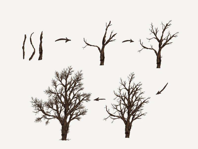
Suddenly you are directing your inner monkey, and you need to tell it where to go. Each of the buttons on your rental car represents a branch for your monkey to go down, and some knobs might have more than one option. This is the branching structure of the possibilities you have before you, the structure of the information tree, the information hierarchy.
Here we are focusing on the informational aspect of experience design. Your application has, most likely, some hierarchical or branching structures, and some web like connections. Now we need to figure out, what are the rules regarding how much information a user can take in at once? How many branches can their monkeys see?
The first person to do research on this, in the context of modern psychology, was George A. Miller, who in 1956 presented the landmark paper "The Magical Number Seven, plus or minus two."
Milgram argued that the space of our short term memory was just this large. Around seven items. I like to think of it as the space of an average sentence, the length of a melodic theme, the amount of digits after which we give up, and so on.
And what's more. Assume that the user is already thinking about what they want for dinner, and what their mother told them on the phone. Your practical space for the design of new elements that you want to present to your user is about 4 "things." Four branches to jump to.
I know you have a lot of questions. Let me list them:
1. How can we ever do anything if we can only relate to four things?
2. How can I make sure not to overwhelm the user?
3. How can there ever be more complex things in this world?
I'm glad you asked! Let us tackle these one by one.
1. How can we ever do anything if we can only relate to four things?
Ah, I see where I misled you. The short term memory is a sort of window for what you can think of at the same time. Think of the monkey only being able to see four branches. But once you move along, you'll be able to see four more. We can jump from thought to thought, never knowing where it will take us.
There is also the concept of "chunking". When we learn our ABCs, we have to learn one letter at a time. But pretty soon we are making words, and shortly we'll be reading words instead of letters. This is the process of chunking. Take four things, and make them one. Four letters become one: "four -> 4".
The first time a user sees a date picker, they will have to puzzle out how it works. This element alone will be daunting to the child that first encounters it. But after a while, an experiences user will have chunked it down as a singular element. It is simply "the date picker."
This also goes for user interfaces in general. We may provide a top level menu. This top level menu has a branching structure. Before the user has familiarised themselves with our program, then top level branches are all there is. They cannot think "beyond" the top level menu. However, after a while, they learn to chunk simpler actions under the pre- chunked terms we have given them.
As an example. Say you want to send an email to Mark. You open your browser, then go into your email provider, then press "compose." The complete structure of the tree of possibilities, were in this instance chunked into a top level action of "open your browser", a very wide tree that is most often the start of your computing experience.
2. How can I make sure not to overwhelm the user?
As I hinted at before. It is our task as UI and UX designers to trim the branches of our informational structures, to make sure that there are never too many options. For any single page, if it should naturally contain many elements, make sure to group them into separate categories not containing more than a handful of elements.
Where possible, we should introduce functions gradually. And if all else fails, use checklist-like structures - which are excellent for guiding users through unfamiliar, complex, and rarely used interactions.
If you are asking the user to put on the dishwasher. Having more than four or five top level options is good. If you are asking the user to perform a yearly maintenance on that same dishwasher, you better provide a checklist. (knowledge here comes courtesy of the Checklist Manifesto)
3. How can there ever be more complex things in this world?
You should already know the answer to this one by now. We are living in a world of systems, of hierarchies of hierarchies of interactions, each of which we only interact with on the surface level, made by clever designers such as you and me to present usable surfaces of interaction.

We don't need to be afraid of making complex programs for our users. I, for one, believe in the capacity of people to do amazing things. But we need to take care of their monkey minds, only being able to see four branches at a time - prone to wandering away on a random walk if they are overwhelmed, lost in the tree of knowledge.
I hope this article provided some insights. Feel free to reach out, if anything in this article piques your interest.
Sources
Miller, G. A. (1956). The magical number seven, plus or minus two: Some limits on our capacity for processing information. Psychological Review, 63(2), 81–97. Miller: https://archive.org/details/miller1956_202204
Gawande, A. (2009). The Checklist Manifesto: How to Get Things Right. Metropolitan Books.