What are design tokens and how can you use them?
5 min read
·
By Markus Lavoll Gundersrud
·
December 16, 2023

Design tokens have become the latest buzzword in UI design. For some developers, the term is not new, and the way of working with design tokens has been practiced for a while. As the gap between design and development narrows, methods like design tokens are also getting closer to designers.
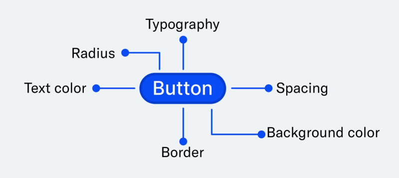
What are design tokens? Design tokens are a concept within design systems used to standardize and manage design elements such as colors, typography, spacing, sizes, and other style attributes. A design token is a representation of a design choice. This representation can be a color choice, radii, font, and so on. One can think of a design token as a nickname or representation of a specific value. Instead of hardcoding values, such as HEX values directly into the design or code, design tokens are used to define them as separate variables or properties. Tokens are scalable and create consistency across devices, such as websites and mobile apps, helping us establish a common language and vocabulary across disciplines.
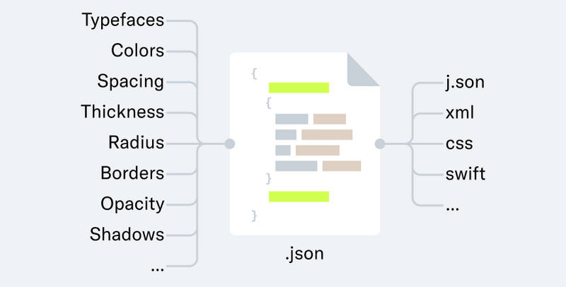
The method of creating design tokens is designed so that the values are platform-agnostic. Being platform-agnostic means that they should be accessible regardless of the tools or technology one chooses to use, written in a way that makes them available across platforms, tools, technologies, and disciplines. By being platform-agnostic, design and development have a common language when discussing token values like colors and similar choices. Design choices can, for example, be stored as a .json file. .json is an open standard file format that can be easily read in multiple programming languages.

Structure and types of design tokens
As mentioned, design tokens are an expression of a design choice in the form of a value. A design token has a name and often a description associated with it, in addition to the value.
An example of a design token

- The name of the token is "radius.button". The name typically follows a naming convention, explaining where or how it should be used without needing to know the represented value.
- The value of the token can, for example, be "12," which in this example would be the number of pixels for the button's radius. The value can also refer to another token, but more on that later.
- In addition to this, it is beneficial to have a description and a category. The description provides additional information that, along with the name, clarifies where or how the token should be used. The category makes it easier to keep track of the different types of tokens.
- A complete token in code might look like this:
{
“name”: “radius.button”,
”value”: “12”,
”description”: “The value used for all the buttons in the design system”,
”type”: borderRadius
}
Core tokens
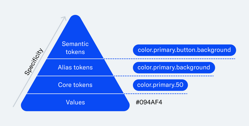
Core tokens, primitive tokens, or global tokens, as they may be called, inform us about the properties and values available. These types of tokens often have raw values, such as HEX codes, percentages, numerical values, etc. Core tokens are never used directly in a design or component but are referenced by other tokens.

Alias tokens
Alias tokens act as a link between core tokens and semantic tokens where there is a need to distinguish tokens with an additional layer. Alias tokens refer to core tokens and are themselves referred to by semantic tokens. They help relate tokens to a context, and multiple levels of alias tokens can be established as needed. In the example below, the alias token also helps understand how large or small the radius is compared to another, as it is named "Radius.medium." If you have "Radius.small" and "Radius.large," you know it represents the middle radius value.

Semantic tokens
Semantic tokens are the tokens used directly on components. They always refer to an alias token or a core token and do not have a hardcoded value associated with them. The name of a semantic token indicates how and where it should be used. For example, "Radius.button."

Composite tokens
Composite tokens are used in principle like semantic tokens but differ in several ways. Regular semantic tokens only refer to another token, while composite tokens consist of multiple tokens referring to different values or tokens. This might sound complicated, but one use case is where a single token value itself does not provide a complete result. A common use case for composite tokens is in styling text. To set up a title text, you have a font, weight, size, kerning, etc. Instead of adding each of these tokens individually to get the title right, you can create a composite token that includes multiple token values, styling the text as desired and providing a complete result.

Where do I start?
Just as components create coherence, design tokens ensure the same but at a more fundamental level. You eliminate uncertainty about which of the X blue colors was the right one to build a specific component because the color tokens are set up in a way that guides your choice.
Implementing design tokens may seem overwhelming, but you don't have to do it all at once. Start with what covers the most significant need. For example, if the component library of the design system has become a bit chaotic, and you need a better way to standardize the values of the components, tokens can be a good way to start that work.
As tokens are implemented, it becomes easier to reuse them across the board, increasing efficiency. If changes arise over time, the time it takes to implement the change also decreases. You only need to modify the relevant token value. Start gradually and build as needed. Not everything has to be implemented all at once.